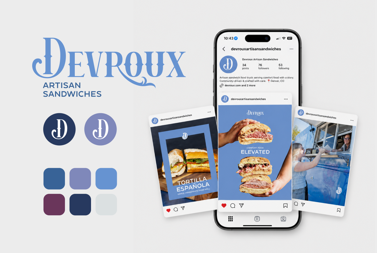
Devroux Artisan Sandwiches

Problem
As an up and coming artisan food truck and catering company entering the competitive Denver market, Devroux Artisan Sandwiches needed a cohesive brand identity that would stand out while authentically reflecting its story, values, and family legacy. The company also required a professional digital presence, consistent marketing materials, and an integrated strategy to build awareness, generate catering and event bookings, and establish credibility from launch.
Solution
ShuBu Creative developed and executed a comprehensive brand launch and integrated marketing strategy designed to establish Devroux as a recognizable, community-focused artisan sandwich brand.
Our team refined and formalized the existing brand identity, creating a cohesive visual system including logo refinements, brand guidelines, menu design, website strategy and copy, professional photography coordination, social media management, email marketing, and public relations support. We also developed messaging centered around comfort, craftsmanship, hospitality, family legacy, and community connection while creating consistent customer experiences across every marketing touchpoint. The campaign positioned Devroux as more than a food truck—it became a memorable Denver artisan sandwich experience built to support long-term growth.
Impact
The integrated marketing campaign successfully launched Devroux Artisan Sandwiches with a polished, professional brand presence that positioned the company for long-term growth and community recognition.
Additional outcomes included:
A refined brand identity with cohesive logo, typography, color palette, and brand guidelines.
A strategic website built to showcase the menu, drive bookings, and tell the Devroux story.
Professional photography supporting marketing across web, social media, PR, and print.
Consistent social media content that increased brand awareness and community engagement.
Email marketing designed to promote catering, events, and customer retention.
Public relations and media materials that strengthened Devroux's visibility in the Denver market.
A unified marketing strategy connecting branding, web, social media, email, photography, and PR.
Clear positioning around handcrafted quality, hospitality, and family-inspired storytelling.
Visit Devroux Artisan Sandwiches at https://devroux.com to see the brand, website, and marketing foundation developed through this engagement.
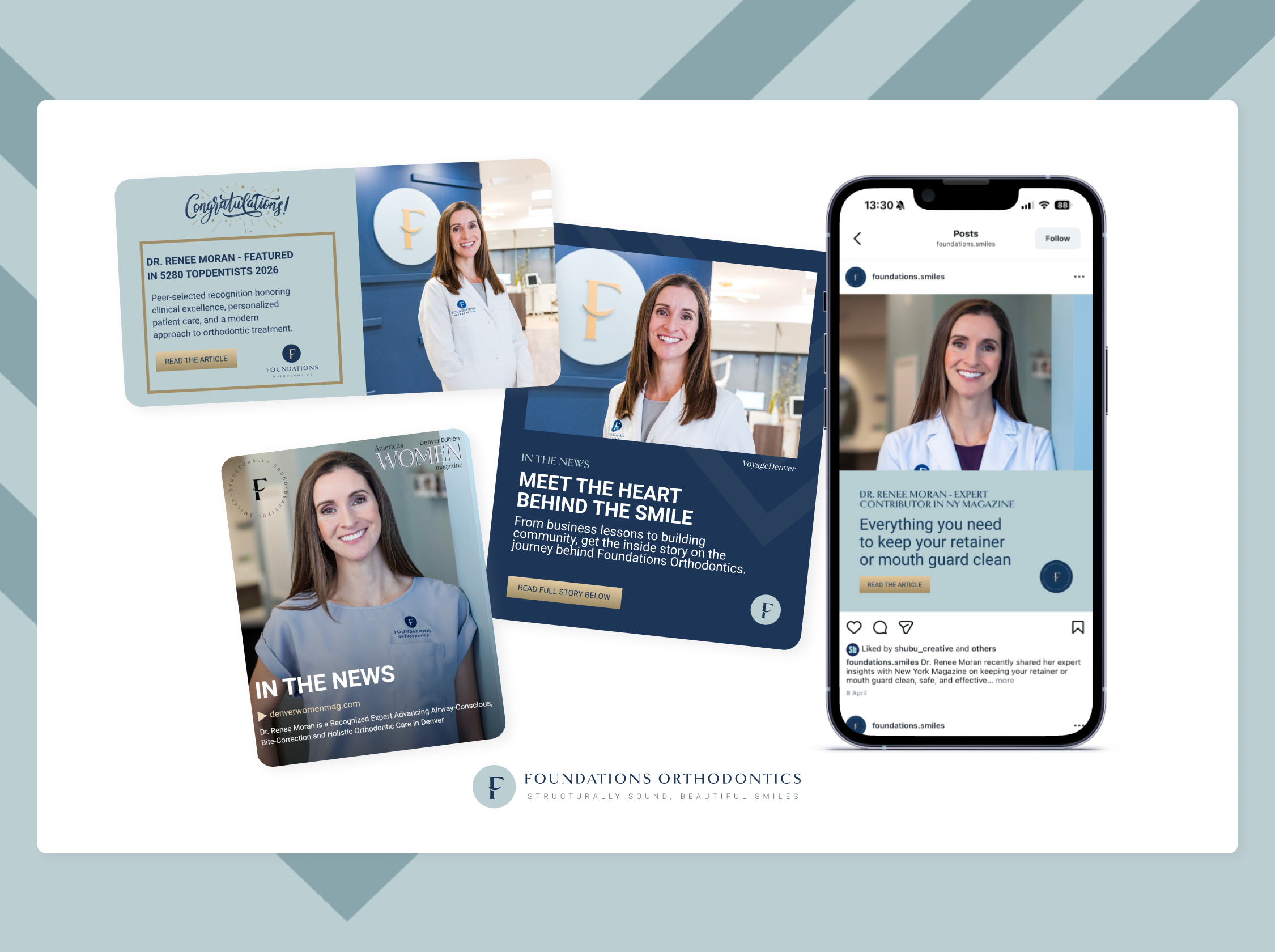
Foundations Orthodontics
Problem
As a growing orthodontic practice in Colorado, Foundations Orthodontics needed to increase awareness of its unique approach to airway-conscious, holistic orthodontic care while differentiating itself in a competitive healthcare market. The practice also sought to elevate the visibility of its doctors, build trust with prospective patients, and support expansion into new markets throughout the Denver metro area.
Solution
ShuBu Creative developed and executed a strategic public relations program focused on physician thought leadership, healthcare expertise, practice growth, industry recognition, and patient education.
We positioned Dr. Renee Moran and Dr. Caitlin White as trusted experts in airway-focused orthodontics, bite correction, and whole-health treatment approaches. Through media outreach, podcast placements, strategic storytelling, physician profiles, award announcements, and business growth communications, we created opportunities to showcase the practice's unique philosophy and clinical expertise.
Impact
The campaign generated media placements and thought leadership opportunities across healthcare, lifestyle, business, and professional media, including:
Colorado Gazette
New York Magazine's The Strategist
Healthcare Industry Today
Americas Women Magazine
The Ripple Effect Podcast
Regional and national business media through syndicated press distribution
Professional healthcare and orthodontic industry outlets
Additional outcomes included:
Recognition of Dr. Renee Moran on the prestigious 2026 topDentists list, selected through a peer-review process of Colorado dental professionals
Increased visibility for Foundations Orthodontics' airway-conscious and holistic treatment philosophy
Elevated profiles for both practice leaders as respected voices in orthodontics and patient-centered care
Publicity supporting the practice's continued growth and expansion within the Denver metro area
Enhanced credibility through physician features, expert commentary, podcast interviews, and industry recognition
Reinforcement of Foundations Orthodontics' position as a leading women-owned orthodontic practice serving children, teens, and adults throughout Colorado
Visit Foundations Orthodontics News & Media page here to see the coverage and awards we’ve secured at https://foundations-orthodontics.com/news-media/
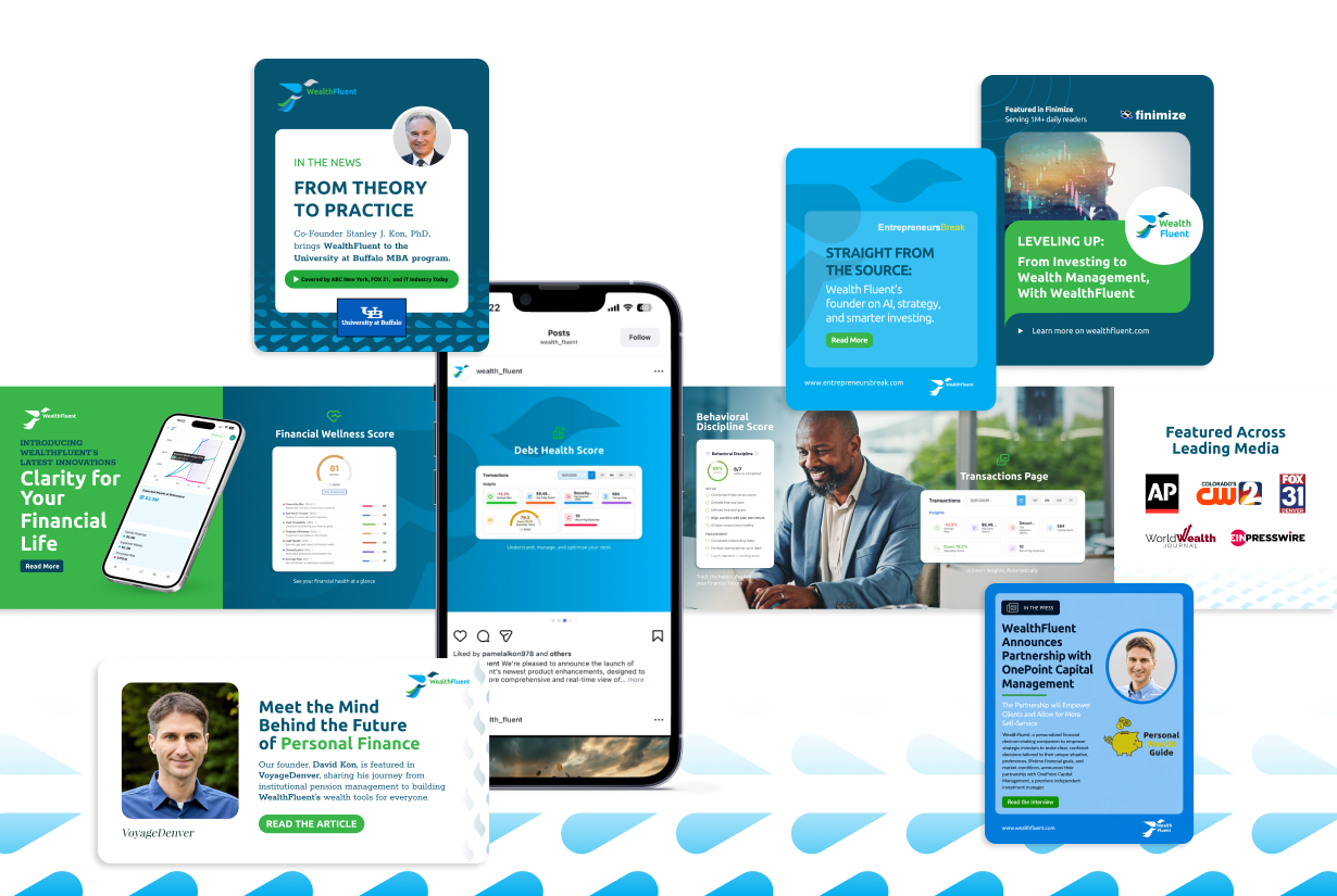
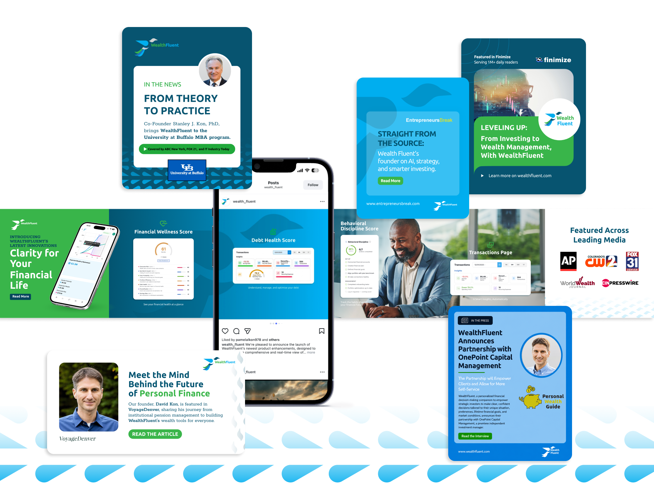
WealthFluent
Problem
As a new fintech platform entering a crowded financial services market, WealthFluent faced the challenge of building credibility, increasing awareness, and differentiating itself from both traditional financial advisors and generic financial planning tools. The company needed to establish trust with investors while introducing a new approach to personalized wealth management powered by artificial intelligence.
Solution
ShuBu Creative developed and executed a strategic public relations program focused on founder thought leadership, fintech innovation, product launches, financial education, and industry disruption.
We positioned CEO David Kon as an expert voice on wealth management, financial literacy, investor empowerment, and the future of AI in finance. Through media outreach, podcast placements, executive interviews, product launch announcements, and fintech industry coverage, we created visibility for both the platform and its leadership team while educating consumers on a new approach to financial decision-making.
Impact
The campaign secured media coverage and thought leadership opportunities across fintech, wealth management, technology, business, and entrepreneurial media, including:
TechBullion
Finimize
FinTech World Post
Marketing Wealth Podcast
Pitch, Build, Scale Podcast
Ventures in WealthTech Podcast
Shoutout Colorado
Authority Magazine
Next Avenue
Global FinTech Series
Multiple national and international business news outlets through syndicated media distribution
Additional outcomes included:
Successful launch and promotion of WealthFluent's AI-powered financial companion, Magpie
National visibility for major platform enhancements and product launches
Increased awareness of WealthFluent's approach to holistic wealth management
Positioning David Kon as a recognized voice in financial literacy and investor empowerment
Expanded exposure within the fintech, investment, and wealth management industries
Establishment of WealthFluent as an emerging innovator helping investors make smarter, data-driven financial decisions through personalized AI technology
Visit WealthFluent’s News & Media page here to see the coverage and awards we’ve secured at https://wealthfluent.com/in-the-news/

The Pickled Beet
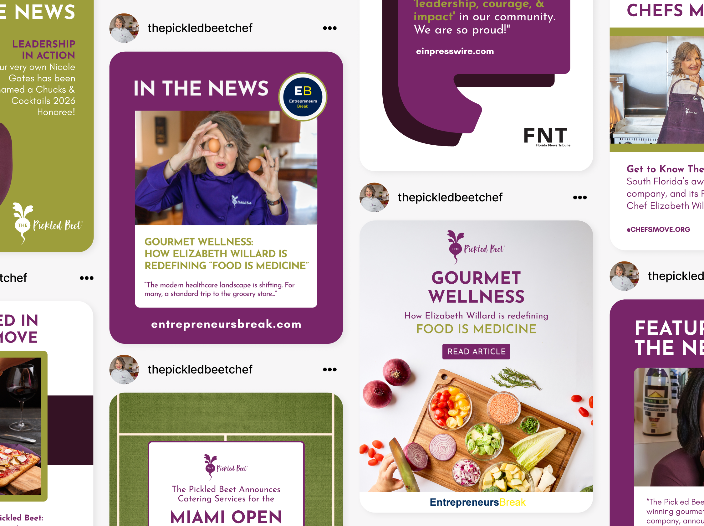
Problem
The Pickled Beet had built a strong reputation through referrals and exceptional service, but lacked consistent media visibility to support growth in its personal chef, catering, wellness, and private aviation dining divisions. The company needed to increase brand awareness, establish Chef Elizabeth Willard as a thought leader, and create third-party credibility that would attract affluent consumers, referral partners, and corporate opportunities.
Solution
ShuBu Creative developed and executed an ongoing public relations strategy focused on thought leadership, company milestones, strategic partnerships, industry awards, and trend-driven media opportunities. We positioned Chef Elizabeth Willard as an expert in food-as-medicine, wellness, special dietary lifestyles, and luxury culinary experiences.
Our team secured interviews, feature stories, award recognition, podcast appearances, and business news coverage while developing a steady stream of newsworthy announcements. Coverage highlighted The Pickled Beet's expertise in personalized nutrition, private chef services, in-flight catering, functional medicine partnerships, major event catering, and company growth.
Impact
The campaign generated media placements across regional, national, industry, and niche wellness outlets, including:
AP News
Digital Journal
Business Air News
Voyage Miami
Lifestyle Magazine
Word of Mom Radio
Chefs Move
Catering Business Journal Florida
Florida News Tribune
Guide to Florida
Miami Herald (historical coverage)
Multiple syndicated business news networks through EIN Presswire distribution
The additional visibility and strategic award submissions also helped secure awards, recognition and partnerships:
Best of Florida Caterer (2024)
Best of Florida Event Caterer (2025)
Recognition among Florida's top women-led businesses
Expanded awareness of The Pickled Beet's food-as-medicine philosophy
Increased visibility for strategic partnerships, including the Q Institute and Sideral Linhas Aéreas airline
Enhanced credibility with luxury, wellness, and private aviation audiences
Visit The Pickled Beet’s News & Media page here to see the coverage and awards we’ve secured https://thepickledbeet.com/in-the-news/

Savor Culinary Services
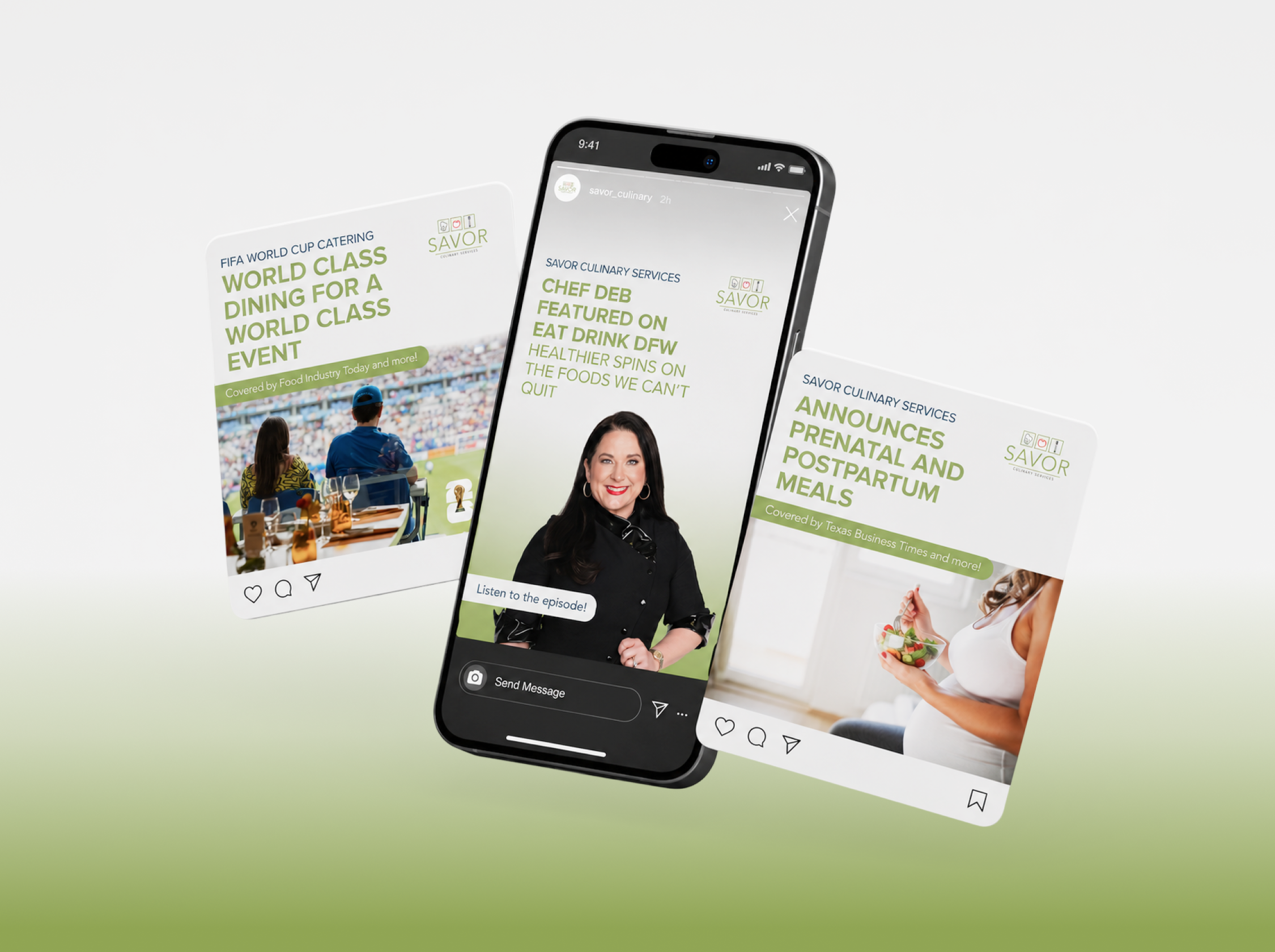
Problem
After more than two decades in business, Savor Culinary Services had built a loyal client base throughout the Dallas-Fort Worth area, but needed greater visibility to support growth across its personal chef, catering, wellness, and private aviation dining services. Founder Chef Deb Oxman also wanted to establish herself as a recognized authority in personalized nutrition, food-as-medicine, and culinary wellness while differentiating Savor from traditional catering companies.
Solution
ShuBu Creative developed and executed a strategic public relations program focused on thought leadership, business milestones, industry innovation, strategic partnerships, award recognition, and community impact.
We positioned Chef Deb as an expert voice on healthy eating, personalized nutrition, special dietary needs, private aviation dining, and holistic wellness. Through a combination of media outreach, press releases, award submissions, podcast appearances, television interviews, and partnership announcements, we created a steady stream of newsworthy stories that elevated both the founder and the brand.
Impact
The campaign generated coverage across television, business, lifestyle, aviation, food, and wellness media, including:
Good Morning Texas
NBC Fort Worth
Fort Worth Report
Voyage Dallas
Dallas Women’s Magazine
Business Air News
Airline Industry News
CultureMap Dallas
Stroll Westlake
Word of Mom Radio
Business Press
KDAF CW33
360 Magazine
Multiple regional and national business news networks through syndicated media distribution
Additional outcomes included:
Increased visibility for Savor’s private aviation catering division
Recognition of Chef Deb as a Dallas Business Journal Women in Business award recipient
Expanded awareness of Savor’s food-as-medicine philosophy
Media coverage surrounding strategic wellness partnerships and community initiatives
Promotion of new service offerings, including customized snack memberships, cooking experiences, holiday catering programs, and wellness-focused collaborations
Reinforcement of Savor's position as a leading provider of personalized culinary services throughout the Dallas-Fort Worth market
Visit Savor’s News & Media Page to see the coverage and awards we’ve secured at https://www.savorculinaryservices.com/about/in-the-press/

RPM Builders

Problem
RPM Builders did not have a premium brochure to show potential clients. Even though they have been in business for 20 years, this was not a project they had taken on until they met the ShuBu Creative team.
Solution
We identified their primary services - commercial build-outs and residential remodeling - and asked about the projects they were proud of in these sectors. We honed in what makes them different, their values and their process. We worked with them to collect imagery of their best projects in both sectors to create two separate brochures, one for each audience. The sales brochures also showcases their process, their experience and credibility.
Impact
While it seems like a simple project, it takes time and focus to get something like this done. RPM Builders now has a fantastic brochure to use in all sales presentations, along with a digital version they can email to prospective clients.

Elkco Properties
We helped Elkco Properties pull together a portfolio to showcase more than 30 years of real estate acquisitions, developments and investments, spanning six states and employing 300 associates. The company printed 250 of these books to give to potential partners, investors, loan officers, city officials, etc. to identify new opportunities, attract investors and reach new markets.


Sun Life Health


Problem
Sun Life Health (SLH) is a quality healthcare network and provider in Pinal County, Arizona. Their resources and reputation have grown over the last 45+ years and they came to ShuBu Creative to update their brand and messaging to better reflect who they are in today’s market. After a deep analysis, we discovered several key areas in need of alignment for both consistency and clarity.
We found that they had inconsistent branding across service lines, different naming conventions and slightly varying logos at their various locations. In fact, we determined that the logo and colors were very similar to Walmart’s branding, which ultimately translated to a discount feel in the consumer’s eye and did not show the depth and breadth of what they offered— top quality healthcare.
Through focus groups and our signature interview process, it was revealed that the word 'center,' which appeared in all their service lines, had different meanings to prospective patients. Finally, we found very little diversity in their marketing assets despite locations in very diverse areas.
Solution
We began by renaming Sun Life Family Healthcare Center to Sun Life Health. Next, we created a brand and visual identity to reflect that they are quality, reputable healthcare providers for everyone, regardless of race, age or socio-economic status. We updated the color palette to a brighter, more modern aesthetic- one unique to SLH. In addition to redesigning the logo to mark a sun moving in a circle, symbolizing innovative patient-centric care, we also changed all of their brand and marketing photography to be more inclusive and diverse. Finally, we launched a new messaging platform with more engaging, value-driven language to ensure connection with the audience.
Impact
Sun Life Health now has solid brand guidelines and consistent branding across all channels. Since the re-brand, the organization has received several community recognitions, federal grants and awards. Executives at the hospital reported that they show an increase in awareness in the community by the volume of phone calls and appointments being made. They also reported the branding has also made recruiting easier, there have been fewer recruiting issues since redesigning the brand and website.

Springwood Retirement


Springwood Retirement is wwned and operated by our client, Elkco Properties, an established Denver-based developer. Springwood Retirement Campus needed a modern update. We worked with Springwood Retirement Campus to update and freshen up all of their marketing to be simple, impactful and storytelling in nature. The butterfly theme was seen throughout the original branding as well as a symbol throughout the retirement campus itself, which inspired ShuBu to bring it into the new visual identity .

The Reserve at Lone Tree


It's always a unique challenge to create a house of brands. Experience Senior Living develops senior housing communities across the country. Their newest community, The Reserve in Lone Tree, will break the mold of traditional seniors housing communities, allowing residents, families and team members to experience luxury living together.
Leveraging a strategy mimicking the hotel house of brands, Bonvoy Marriot, we developed four brand identities that encompass forward-thinking experiences in senior living: The Reserve, The Gallery, Sancerre and The Crossings all under the family of Experience Senior Living communities across the country.
We created the Experience Senior Living umbrella brand first to house varying levels of innovative housing for seniors from affordable, premium to luxury.
Check out The Reserve!
Latitude40 Real Estate Group


Bringing this 20-year in the making brand to life has been an honor. Every detail is the ideation of the founder himself, Jay Hebb. From helping Jay name his brokerage, to creating signage and finding unique ways to represent his investment, development and residential real estate portfolio with the utmost integrity has been key to developing the Latitute40 brand.

Homestyle Direct


We built and designed a website with an e-commerce meal shopping and ordering experience, a multi-level case manager referral form process and integrated it with the company’s CRM system.
Problem
Homestyle Direct recognized the need to evolve its brand to better align with its growing offerings and changing market dynamics—the company had grown from a meal delivery service for food insecurity into a comprehensive healthcare company offering home-delivered meals to Medicaid Advantage and Medicare members.
The existing brand identity was 26 years old and no longer fully represented the company's full offering, necessitating a comprehensive rebranding. The challenge was to develop new messaging and a visual identity that positioned Homestyle Direct as a healthcare company with many meal choices and meals that were medically tailored to specific disease states - heart disease, renal disease, diabetes, gluten intolerance and other chronic conditions. Additionally, the rebranding had to be implemented across all platforms, including an outdated e-commerce website, to ensure a cohesive and seamless experience for multiple audiences: elderly, adult children, healthcare case managers, state agencies and healthcare companies.
Solution
The initial step involved comprehensive market research to understand industry trends, customer needs, and the competitive landscape. This research laid the foundation for developing a messaging strategy that would resonate with the target audience. The key focus was to hone in on the messaging that accurately reflected the brand's values and offerings. Alongside the messaging refinement, a new visual identity was developed and launched. The visual identity comprised a new logo, colors, supporting graphical elements, iconography, font packages and photography style. Once approved and trademarked, we updated the website design, all social media channels, and email templates to reflect the new brand image and messaging. This also included programming a new e-commerce website (not only frontend design), fully designed to meet the needs of multiple audiences, including a shop for meals, referral forms for case managers and information for state agencies and partners. To ensure effective implementation, training and communication were provided to the internal team on how to use the messaging toolkit and all new sales collateral effectively. This step was crucial to maintaining a unified brand voice across all departments and platforms. Included in the training was lots of new swag given out to employees, including puffer jackets, hoodies, stickers, pens, and more! The final step was launching a comprehensive marketing campaign targeting Case Managers, and also the company’s database of current members. The invigorated communications were sent consistently and frequently to both case managers and the existing members. We leveraged Homestyle Direct’s social media channels, CRM databases, and national press releases to communicate new medically-tailored meals, updated menus, and the variety the company provided for its members.
Impact
Here's the exciting part: We met the challenge and exceeded it! Meal orders skyrocketed by an impressive 87% year-over-year, and we grew their customer base by 32% after the first marketing campaign post-rebrand. Now after 2-years, revenue grew from $40M to $60M due to the re-branding, new marketing efforts, strong sales team and stronger operations overall.

Farmhouse Villas

We helped Elkco Properties, an established Denver-based development company with a name, logo, visual identity, aerial photographs, content and execution of an extensive 15+ page pitch deck for investors. The deck went out to potential investors, and the development was fully funded to go forward and is located in Lone Tree, Colorado.

Mikvah of East Denver

Problem
A unique development was coming to the Jewish Community in Denver—this project entailed developing a brand for a Mikvah 'coming soon to Denver. While the Mikvah was not operational, the goal was to raise enough money to sustain construction.
Therefore, we need a strong brand that catches high-end donors' attention.
Solution
While being built, we developed a strategy to promote the construction project and gain awareness in the community with a vibrant and relevant visual identity and messaging system. The messaging was open to anyone and education-focused, while the visual identity needed to be fresh and modern.
Impact
The brand reflected a water-like feel derived from what a Mikvah is for the Jewish community. The dots resembled a Jewish star within the design, which was modern and catchy. In addition, a watercolorist enhanced the brand by texturing the renderings and photographs, giving the entire brand an elevated and classy feel.
We helped a 20-year in the making vision come to life and launch in six months. Now, the Mikvah not only raised $250 Million in the capital, but they are also up and running now and serving the Jews in Denver and surrounding areas.

Vannin Chief of Staff


Problem
Formally known as Vannin Consulting, their name and brand did not clearly explain the benefit of what they deliver. They were about a year into business, but growing quickly. When Vannin started, there were not many doing what they did in the marketplace.
Solution
We immediately changed their name from Vannin Consulting to Vannin Chief of Staff to be more specific around what they offered—placing chief of staff in scaling and global companies. We createda brand that was more engaging and dynamic than the limited organizations in their industry. We wanted them to standout so we went with a bold approach vs. the traditional feel that we got from our competitor research. Keep in mind there were not many competitors at the time. They came to us in the early states with a basic brand using stock photos, limited color and lack of clear messaging. We improved their messaging to align with who they were at the time, but we thought about the future and the potential they had. We updated their logo and visual identity to be unique, bold and modern. We implemented a marketing plan focusing on Linkedin, collateral for clients such as pitch decks and brochures, and also got started on media outreach for credibility.
Impact
Vannin Chief of Staff has reported 80% growth year-over-year since branding then and they’ve seen their followers increase from almost nothing on Linkedin to now more than 3,000 and growing. Not only have they increased their revenue threefold over two years, our PR efforts have helped them be recognized in global business publications. We also helped the founder/CEO apply for awards and she was named a 40 under 40 person to watch by the Denver Business Journal.

Dolgin Leadership Group


Problem
Dolgin Leadership Group, formerly BraverMe, realized the need for a more robust and refined brand as their clients evolved from emerging to established leaders. The previous brand identity and messaging no longer accurately represented the depth and breadth of their coaching, training, and facilitation services, which now focused on leadership and communication coaching. They required a new brand to better resonate with their target audience and convey their value proposition more clearly.
Solution
To create a more sophisticated and compelling brand for Dolgin Leadership Group, the team embarked on a comprehensive rebranding process. The first and most visible change was the transition from BraverMe to Dolgin Leadership Group. This change helped position the brand as a group focused on leadership and solidify its credibility in the industry.
Additionally, the brand's visual identity was revamped. The previous logo, featuring a sun, was replaced with a flame symbolizing transformation and growth. The winding path within the flame signified the journey and guidance provided by Dolgin Leadership Group. The tagline "Bring out your best" was replaced with "Lead with Clarity," reflecting their commitment to helping leaders achieve clarity in their decision-making and actions.
Furthermore, a new website was developed to showcase the updated brand and provide a more intuitive and user-friendly experience for visitors. The website incorporated the new visual elements and presented the range of coaching, training, and facilitation services offered by Dolgin Leadership Group in a clear and organized manner.
Impact
The rebranding efforts undertaken by Dolgin Leadership Group had a significant impact on their positioning, messaging, and overall perception in the market. The transition to a more refined and sophisticated brand allowed them to better align their identity with the evolving needs of their clients.
The new brand name, Dolgin Leadership Group, conveyed a sense of professionalism and expertise, further establishing its credibility as a trusted partner in leadership development. The updated visual identity, with the flame and winding path symbol, evoked a sense of transformation, growth, and guidance, resonating with their target audience of established leaders.
The tagline change to "Lead with Clarity" succinctly communicated the core value proposition of Dolgin Leadership Group. It positioned them as experts in helping leaders navigate complex situations and make informed decisions with clarity and confidence.
The newly developed website provided a platform for Dolgin Leadership Group to showcase its services and expertise in a more organized and visually appealing manner. It allowed potential clients to quickly understand the range of coaching, training, and facilitation offerings, leading to increased inquiries and engagement.
Overall, the rebranding of Dolgin Leadership Group resulted in a more substantial brand presence, clearer messaging, and improved market positioning. The refined brand identity and updated website played a crucial role in attracting the right target audience, conveying the value of their services, and establishing Dolgin Leadership Group as a trusted partner in leadership development.

Dreaming Tree Wellness

ShuBu created a completely new brand from ground up for Dreaming Tree Wellness—a massage therapist. Based on the founder's, Misty Burne, love for trees, the outdoors, and a strong belief system around the importance of having a healthy foundation to live life to the fullest, the common thread shines through this brand. Check it out for yourself at Misty's website above to learn more and book an appointment while you are at it!

Connected EC


Problem
Connected EC, a 12-year-old leadership coaching firm at the time of rebranding, had evolved over the years and faced challenges communicating its services and unique value proposition. Their website was intended to attract more executive coaches and clients (large corporations and organizations), but very few understood what the company did. Additionally, they needed assistance positioning themselves as an authority in the industry and increasing their visibility among positive organizational psychologists, researchers, and corporations worldwide. This was a huge issue because its value proposition, core services, mission, and vision were unclear, preventing them from scaling and reaching their goals.
Solution
ShuBu Creative addressed challenges faced by Connected EC by defining its core services, focusing on leadership, teams, and organizations, and creating a tagline, "CREATE THRIVING LEADERS, CONNECTED TEAMS, AND POSITIVE CULTURES." They modernized the brand's look with vitality-inspired colors and graphics. ShuBu also developed a digital content strategy, monthly social media posts, and earned media, enhancing brand awareness and credibility. Their content covers wellbeing, leadership, burnout, vitality, and positive organizational psychology while maintaining a consistent visual identity.
Impact
The partnership with ShuBu Creative has transformed Connected EC, propelling its growth and enhancing its market visibility. The rebranding initiative, which more effectively communicated the company's core functions, coincided with a doubling in revenue in the same year. This success was further augmented by the expansion of the coaching team and significant media coverage in CEO Global Magazine, Colorado Biz Magazine, various blogs and podcasts, and local news stations.
The impact of the launch of a robust digital content strategy was immediate and substantial. Within just five months, Connected EC's LinkedIn presence surged by 1000%, drawing the attention of academics and corporations globally. This increased exposure, coupled with a more impactful brand presence and broader reach, is a testament to the effectiveness of the rebranding.
Overall, the collaboration with ShuBu Creative not only elevated Connected EC's brand positioning but also played a crucial role in its rapid scale-up and success in the industry. The company's revised messaging, overhauled website, and strategic digital content approach were key drivers in this remarkable growth trajectory.
Connected EC reported that its revenue nearly tripled following the rebrand and marketing efforts due to people knowing what they did when they got to the website. They were also able to attract more talent to work for Connected EC for the same reason. With this newfound brand clarity, they were able to clearly communicate their mission, vision, services, etc.

Butterfly Rising Institute

Problem
Butterfly Rising Institute, an organization dedicated to empowering and supporting single mothers, faced challenges with its outdated website, unclear messaging, and unrefined branding. They needed help to effectively communicate their mission, connect with their target audience, and secure partnerships with notable groups.
Solution
ShuBu Creative partnered with Butterfly Rising Institute to revamp its brand and online presence. Through a collaborative process, ShuBu Creative identified the key issues and devised a comprehensive solution.
Website Redesign: ShuBu Creative developed a visually appealing and user-friendly website for Butterfly Rising Institute. The new website showcased its mission, programs, and success stories compellingly, creating a seamless user experience.
Logo Refinement: ShuBu Creative refined Butterfly Rising Institute's logo to align with its vision and values. The updated logo captured the essence of transformation, resilience, and empowerment, visually representing their mission.
Clear Messaging: ShuBu Creative worked closely with Butterfly Rising Institute to craft clear and impactful messaging. They refined the organization's brand story, mission statement, and program descriptions to communicate their value proposition to potential partners and single mothers.
Impact
The collaboration between ShuBu Creative and Butterfly Rising Institute resulted in significant positive outcomes:
City Program Partnerships & Workshops: Through the brand transformation, Butterfly Rising Institute secured a partnership with the City of Denver Wellness Program. This partnership allowed them to offer their 8-week program for single mothers to a broader audience, enhancing their reach and impact. This improved visibility attracted the attention of other notable groups, leading to more partnerships and collaborations that further expanded their influence.
Enhanced Clarity and Engagement: The clear messaging developed by ShuBu Creative resonated with single mothers and critical stakeholders. It helped prospective participants understand the value of the 8-week program, leading to increased enrollment and active engagement within the community.
Public Relations Coverage: Butterfly Rising Institute has been featured in various podcasts, blogs, trade pubs and more due to ShuBu’s ongoing public relations efforts to increase brand awareness.
Overall, ShuBu Creative's strategic approach to branding and messaging revitalized Butterfly Rising Institute's image, enabling them to make a meaningful impact on the lives of single mothers. By providing a compelling online presence, refined logo, and clear messaging, ShuBu Creative empowered Butterfly Rising Institute to reach its target audience, forge valuable partnerships, and foster positive change in the community.

Epilectra, A Graphic Novel Series

Problem
Author and creator of Epilectra, The Graphic Novel Series, Sue Seserman, came to ShuBu Creative with the brilliant concept of a team of superheroes with disabilities who were making the world a better place. The script was written and the illustrations were hand-drawn by Sue herself. She presented it to ShuBu in a spiral-bound notebook. Sue and her husband, Doug, a seasoned corporate marketing professional, knew this book had a promising future and a vital message to spread. First, however, they wanted help getting it launched and looking professional and then wanted marketing and PR support after it was published.
Solution
First, we tackled the brand. We worked with the author, Sue Seserman, to narrow down the key brand pillars of her novel and visually develop the characters in a digitized way. We solidified a clear mission, vision and values as well as a tagline: Transforming Disability into Superability. We created a logo, color palate, fonts and unique visual identity.
We determined how to position the book to preteens, parents, and loved ones of those with disabilities as “edutainment” as well as inspiring. We worked with Sue to hire an illustrator that fit the needs, vision, and style of the book. Once we found the right designer, we went to work to bring the characters and brand to life.
We developed the characters, the storyboards, and the brand messaging pillars. Once we determined the characters and the brand messaging, we created a website, media kit and other marketing materials like business cards and talking points to bring to conferences and networking events. At the same time, we worked on building a social media presence, followers and general disability awareness.
We implemented an ongoing monthly e-newsletter and blog to Sue’s growing database of contacts to keep audiences engaged while we waited for the book to publish.
After three years of hard work, Epilectra was published in 2024! We strategically began a PR campaign leading up to the launch in order to have credibility when the book was released. We executed heavy media outreach 6-months prior to the release knowing that coverage would happen closer to book launch.
We also increased our social media presence during this 6-months time-period, layering in more content, reels, stories and more static posts. We continued the monthly blog and newsletter, but added in more email marketing in addition to the monthly e-newsletter. Additionally, Sue did speaking engagements during this time and anything to gain more exposure. At the time of the book release, we already had buzz. Finally, we hosted a book launch party and celebrated with friends, family and industry contacts.
Impact
Through ShuBu’s partnership, PR, branding and marketing efforts the graphic novel received national and local attention. Social media audiences grew from zero to thousands of followers on Linkedin, FB, Instagram and Twitter. The novel received endorsements from associations such as the National Epilepsy Foundation, Invisible Disabilities Association and The Defeating Epilepsy Foundation, and was covered in numerous media outlets including but not limited to: Denver’s prestigious 5280 Magazine, Denver’s Fox31, 9News, Westword, Colorado Public Radio, The Daily Camera, Chicago’s Midwest Book Review, Pittsburgh, The Gazette, and more! The novel’s sales continue to slowly increase as times goes on and is available via Amazon and other online retailers such as Barnes & Nobles.