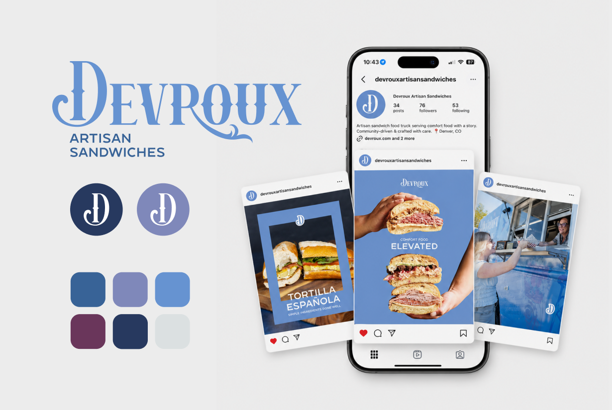
Devroux Artisan Sandwiches

Problem
As an up and coming artisan food truck and catering company entering the competitive Denver market, Devroux Artisan Sandwiches needed a cohesive brand identity that would stand out while authentically reflecting its story, values, and family legacy. The company also required a professional digital presence, consistent marketing materials, and an integrated strategy to build awareness, generate catering and event bookings, and establish credibility from launch.
Solution
ShuBu Creative developed and executed a comprehensive brand launch and integrated marketing strategy designed to establish Devroux as a recognizable, community-focused artisan sandwich brand.
Our team refined and formalized the existing brand identity, creating a cohesive visual system including logo refinements, brand guidelines, menu design, website strategy and copy, professional photography coordination, social media management, email marketing, and public relations support. We also developed messaging centered around comfort, craftsmanship, hospitality, family legacy, and community connection while creating consistent customer experiences across every marketing touchpoint. The campaign positioned Devroux as more than a food truck—it became a memorable Denver artisan sandwich experience built to support long-term growth.
Impact
The integrated marketing campaign successfully launched Devroux Artisan Sandwiches with a polished, professional brand presence that positioned the company for long-term growth and community recognition.
Additional outcomes included:
A refined brand identity with cohesive logo, typography, color palette, and brand guidelines.
A strategic website built to showcase the menu, drive bookings, and tell the Devroux story.
Professional photography supporting marketing across web, social media, PR, and print.
Consistent social media content that increased brand awareness and community engagement.
Email marketing designed to promote catering, events, and customer retention.
Public relations and media materials that strengthened Devroux's visibility in the Denver market.
A unified marketing strategy connecting branding, web, social media, email, photography, and PR.
Clear positioning around handcrafted quality, hospitality, and family-inspired storytelling.
Visit Devroux Artisan Sandwiches at https://devroux.com to see the brand, website, and marketing foundation developed through this engagement.
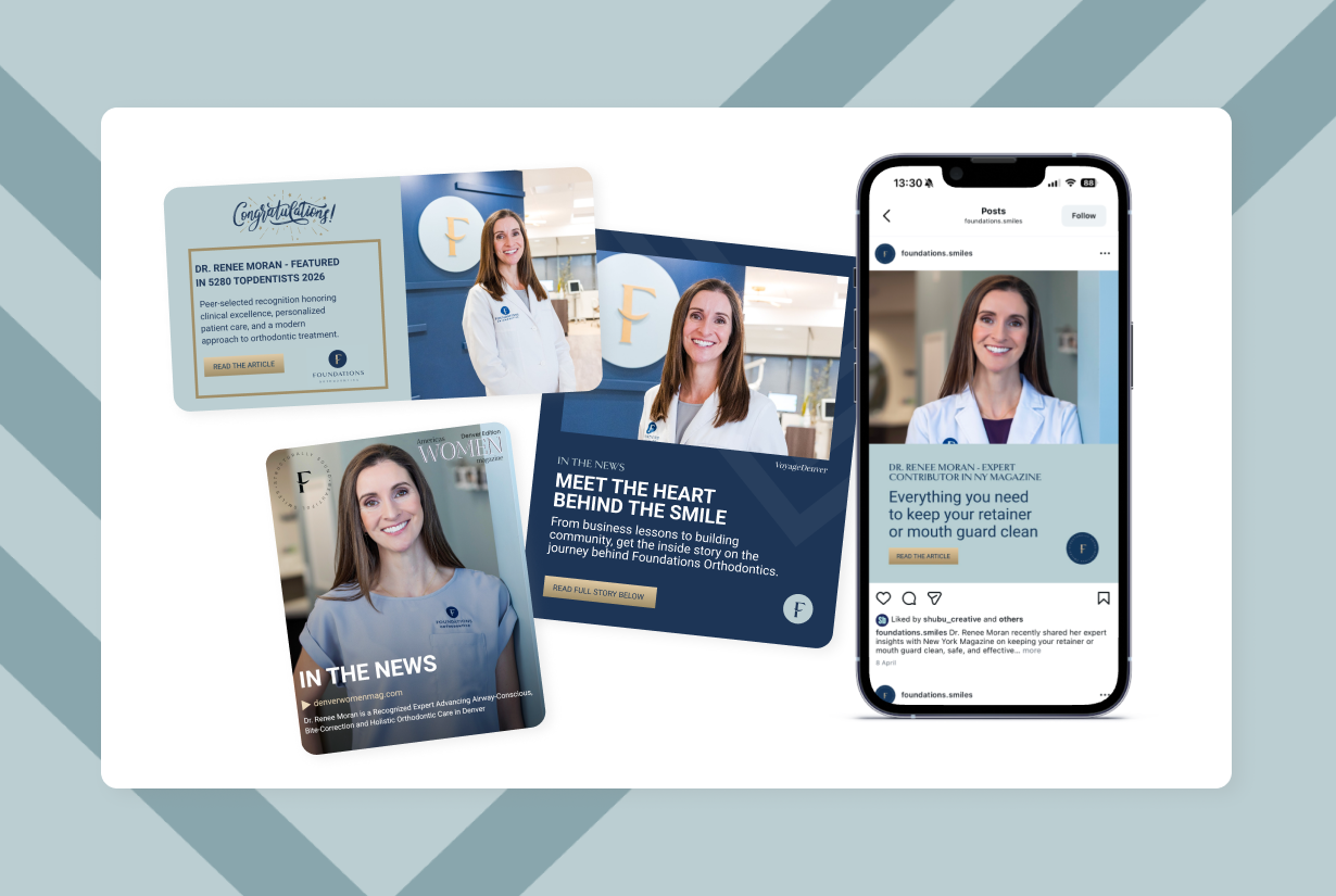
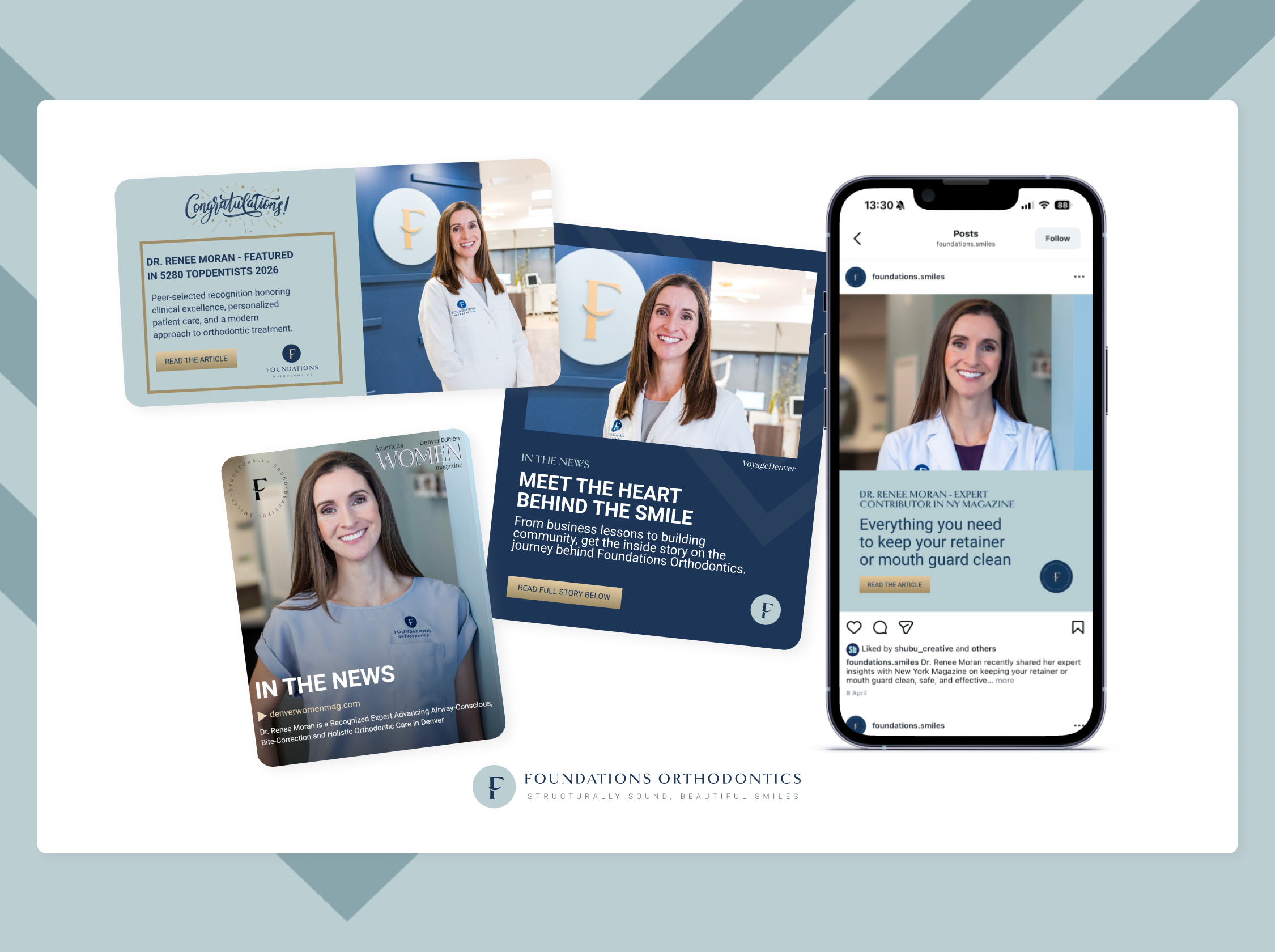
Foundations Orthodontics
Problem
As a growing orthodontic practice in Colorado, Foundations Orthodontics needed to increase awareness of its unique approach to airway-conscious, holistic orthodontic care while differentiating itself in a competitive healthcare market. The practice also sought to elevate the visibility of its doctors, build trust with prospective patients, and support expansion into new markets throughout the Denver metro area.
Solution
ShuBu Creative developed and executed a strategic public relations program focused on physician thought leadership, healthcare expertise, practice growth, industry recognition, and patient education.
We positioned Dr. Renee Moran and Dr. Caitlin White as trusted experts in airway-focused orthodontics, bite correction, and whole-health treatment approaches. Through media outreach, podcast placements, strategic storytelling, physician profiles, award announcements, and business growth communications, we created opportunities to showcase the practice's unique philosophy and clinical expertise.
Impact
The campaign generated media placements and thought leadership opportunities across healthcare, lifestyle, business, and professional media, including:
Colorado Gazette
New York Magazine's The Strategist
Healthcare Industry Today
Americas Women Magazine
The Ripple Effect Podcast
Regional and national business media through syndicated press distribution
Professional healthcare and orthodontic industry outlets
Additional outcomes included:
Recognition of Dr. Renee Moran on the prestigious 2026 topDentists list, selected through a peer-review process of Colorado dental professionals
Increased visibility for Foundations Orthodontics' airway-conscious and holistic treatment philosophy
Elevated profiles for both practice leaders as respected voices in orthodontics and patient-centered care
Publicity supporting the practice's continued growth and expansion within the Denver metro area
Enhanced credibility through physician features, expert commentary, podcast interviews, and industry recognition
Reinforcement of Foundations Orthodontics' position as a leading women-owned orthodontic practice serving children, teens, and adults throughout Colorado
Visit Foundations Orthodontics News & Media page here to see the coverage and awards we’ve secured at https://foundations-orthodontics.com/news-media/
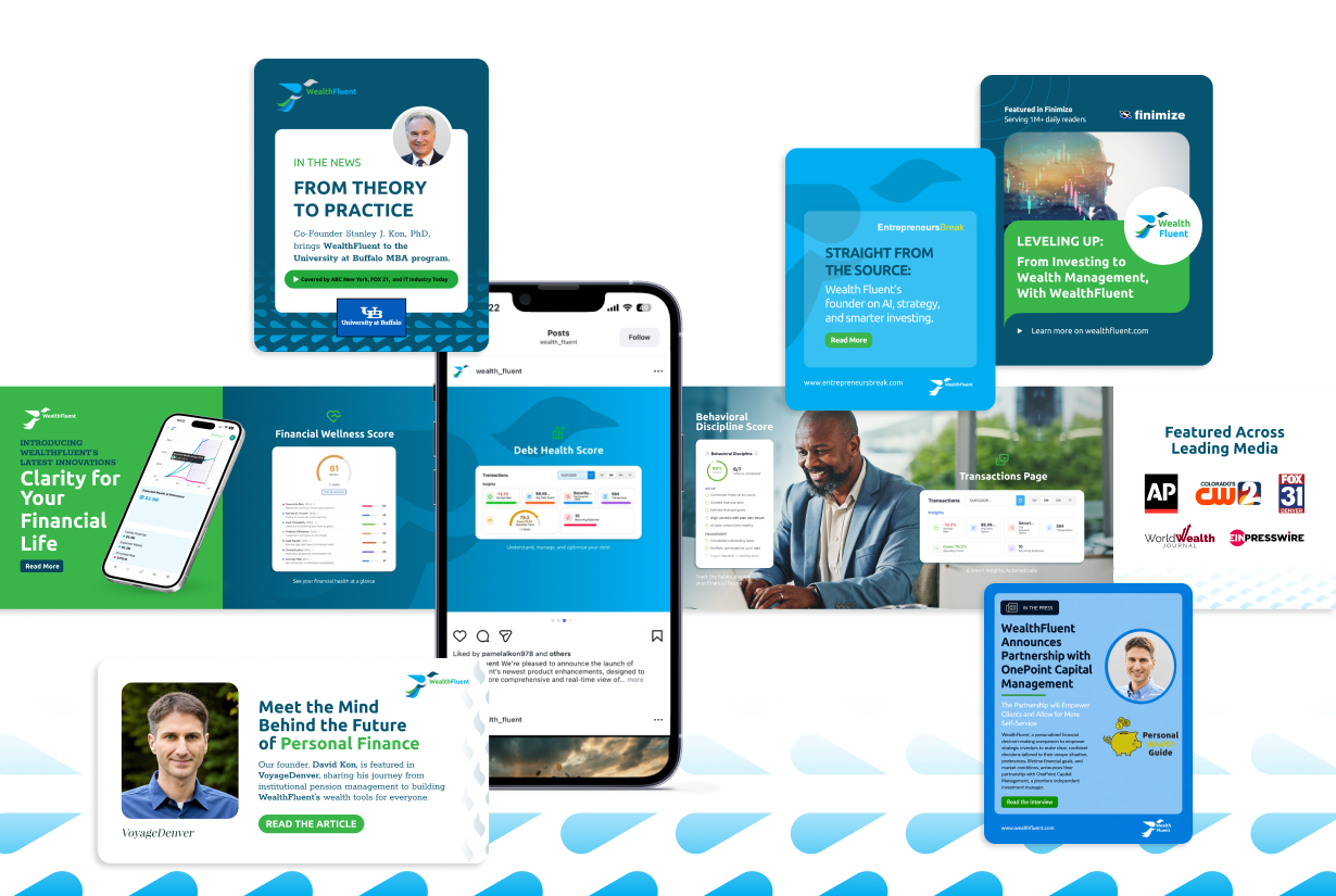
WealthFluent
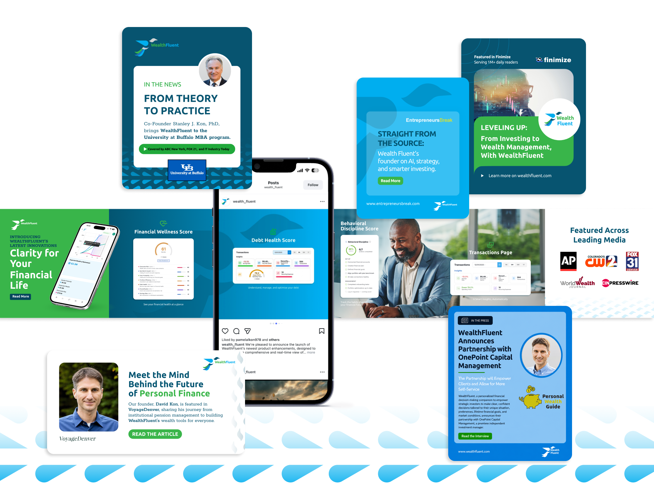
Problem
As a new fintech platform entering a crowded financial services market, WealthFluent faced the challenge of building credibility, increasing awareness, and differentiating itself from both traditional financial advisors and generic financial planning tools. The company needed to establish trust with investors while introducing a new approach to personalized wealth management powered by artificial intelligence.
Solution
ShuBu Creative developed and executed a strategic public relations program focused on founder thought leadership, fintech innovation, product launches, financial education, and industry disruption.
We positioned CEO David Kon as an expert voice on wealth management, financial literacy, investor empowerment, and the future of AI in finance. Through media outreach, podcast placements, executive interviews, product launch announcements, and fintech industry coverage, we created visibility for both the platform and its leadership team while educating consumers on a new approach to financial decision-making.
Impact
The campaign secured media coverage and thought leadership opportunities across fintech, wealth management, technology, business, and entrepreneurial media, including:
TechBullion
Finimize
FinTech World Post
Marketing Wealth Podcast
Pitch, Build, Scale Podcast
Ventures in WealthTech Podcast
Shoutout Colorado
Authority Magazine
Next Avenue
Global FinTech Series
Multiple national and international business news outlets through syndicated media distribution
Additional outcomes included:
Successful launch and promotion of WealthFluent's AI-powered financial companion, Magpie
National visibility for major platform enhancements and product launches
Increased awareness of WealthFluent's approach to holistic wealth management
Positioning David Kon as a recognized voice in financial literacy and investor empowerment
Expanded exposure within the fintech, investment, and wealth management industries
Establishment of WealthFluent as an emerging innovator helping investors make smarter, data-driven financial decisions through personalized AI technology
Visit WealthFluent’s News & Media page here to see the coverage and awards we’ve secured at https://wealthfluent.com/in-the-news/

The Pickled Beet
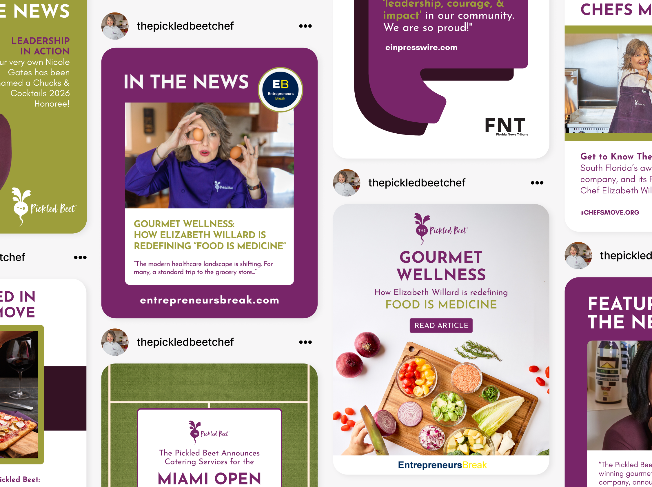
Problem
The Pickled Beet had built a strong reputation through referrals and exceptional service, but lacked consistent media visibility to support growth in its personal chef, catering, wellness, and private aviation dining divisions. The company needed to increase brand awareness, establish Chef Elizabeth Willard as a thought leader, and create third-party credibility that would attract affluent consumers, referral partners, and corporate opportunities.
Solution
ShuBu Creative developed and executed an ongoing public relations strategy focused on thought leadership, company milestones, strategic partnerships, industry awards, and trend-driven media opportunities. We positioned Chef Elizabeth Willard as an expert in food-as-medicine, wellness, special dietary lifestyles, and luxury culinary experiences.
Our team secured interviews, feature stories, award recognition, podcast appearances, and business news coverage while developing a steady stream of newsworthy announcements. Coverage highlighted The Pickled Beet's expertise in personalized nutrition, private chef services, in-flight catering, functional medicine partnerships, major event catering, and company growth.
Impact
The campaign generated media placements across regional, national, industry, and niche wellness outlets, including:
AP News
Digital Journal
Business Air News
Voyage Miami
Lifestyle Magazine
Word of Mom Radio
Chefs Move
Catering Business Journal Florida
Florida News Tribune
Guide to Florida
Miami Herald (historical coverage)
Multiple syndicated business news networks through EIN Presswire distribution
The additional visibility and strategic award submissions also helped secure awards, recognition and partnerships:
Best of Florida Caterer (2024)
Best of Florida Event Caterer (2025)
Recognition among Florida's top women-led businesses
Expanded awareness of The Pickled Beet's food-as-medicine philosophy
Increased visibility for strategic partnerships, including the Q Institute and Sideral Linhas Aéreas airline
Enhanced credibility with luxury, wellness, and private aviation audiences
Visit The Pickled Beet’s News & Media page here to see the coverage and awards we’ve secured https://thepickledbeet.com/in-the-news/

Savor Culinary Services
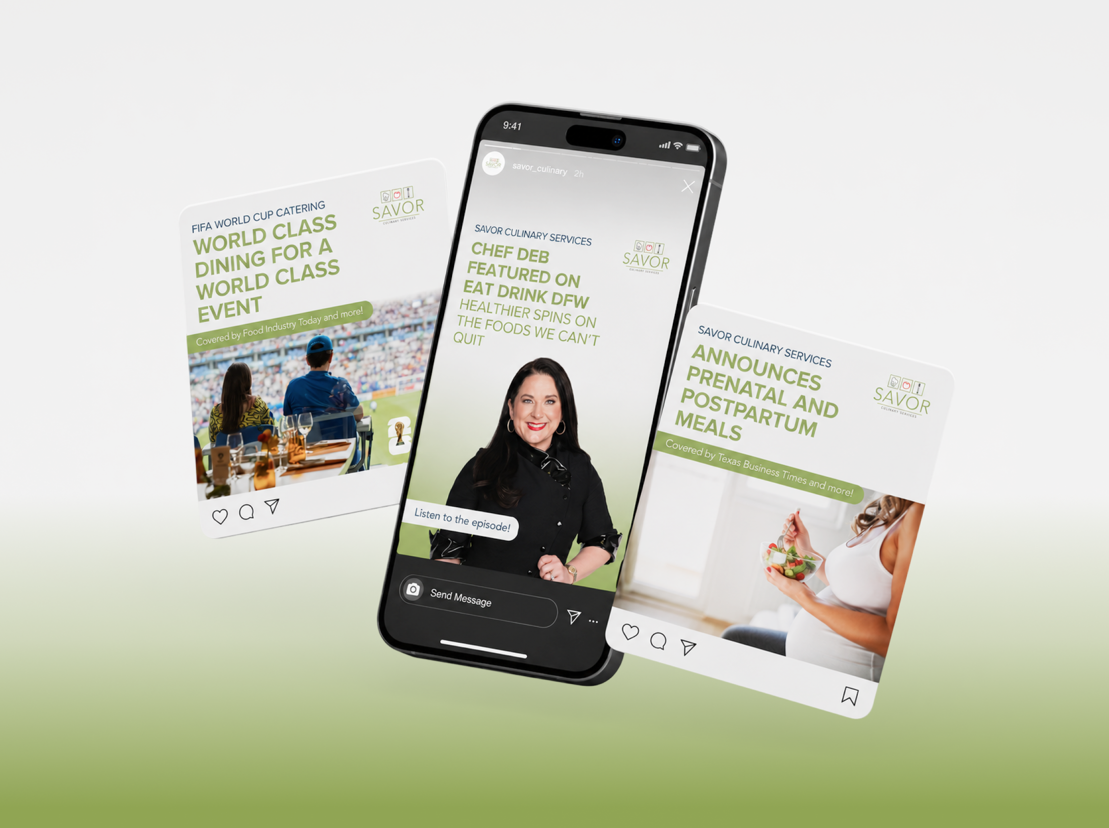
Problem
After more than two decades in business, Savor Culinary Services had built a loyal client base throughout the Dallas-Fort Worth area, but needed greater visibility to support growth across its personal chef, catering, wellness, and private aviation dining services. Founder Chef Deb Oxman also wanted to establish herself as a recognized authority in personalized nutrition, food-as-medicine, and culinary wellness while differentiating Savor from traditional catering companies.
Solution
ShuBu Creative developed and executed a strategic public relations program focused on thought leadership, business milestones, industry innovation, strategic partnerships, award recognition, and community impact.
We positioned Chef Deb as an expert voice on healthy eating, personalized nutrition, special dietary needs, private aviation dining, and holistic wellness. Through a combination of media outreach, press releases, award submissions, podcast appearances, television interviews, and partnership announcements, we created a steady stream of newsworthy stories that elevated both the founder and the brand.
Impact
The campaign generated coverage across television, business, lifestyle, aviation, food, and wellness media, including:
Good Morning Texas
NBC Fort Worth
Fort Worth Report
Voyage Dallas
Dallas Women’s Magazine
Business Air News
Airline Industry News
CultureMap Dallas
Stroll Westlake
Word of Mom Radio
Business Press
KDAF CW33
360 Magazine
Multiple regional and national business news networks through syndicated media distribution
Additional outcomes included:
Increased visibility for Savor’s private aviation catering division
Recognition of Chef Deb as a Dallas Business Journal Women in Business award recipient
Expanded awareness of Savor’s food-as-medicine philosophy
Media coverage surrounding strategic wellness partnerships and community initiatives
Promotion of new service offerings, including customized snack memberships, cooking experiences, holiday catering programs, and wellness-focused collaborations
Reinforcement of Savor's position as a leading provider of personalized culinary services throughout the Dallas-Fort Worth market
Visit Savor’s News & Media Page to see the coverage and awards we’ve secured at https://www.savorculinaryservices.com/about/in-the-press/

Vannin Chief of Staff


Problem
Formally known as Vannin Consulting, their name and brand did not clearly explain the benefit of what they deliver. They were about a year into business, but growing quickly. When Vannin started, there were not many doing what they did in the marketplace.
Solution
We immediately changed their name from Vannin Consulting to Vannin Chief of Staff to be more specific around what they offered—placing chief of staff in scaling and global companies. We createda brand that was more engaging and dynamic than the limited organizations in their industry. We wanted them to standout so we went with a bold approach vs. the traditional feel that we got from our competitor research. Keep in mind there were not many competitors at the time. They came to us in the early states with a basic brand using stock photos, limited color and lack of clear messaging. We improved their messaging to align with who they were at the time, but we thought about the future and the potential they had. We updated their logo and visual identity to be unique, bold and modern. We implemented a marketing plan focusing on Linkedin, collateral for clients such as pitch decks and brochures, and also got started on media outreach for credibility.
Impact
Vannin Chief of Staff has reported 80% growth year-over-year since branding then and they’ve seen their followers increase from almost nothing on Linkedin to now more than 3,000 and growing. Not only have they increased their revenue threefold over two years, our PR efforts have helped them be recognized in global business publications. We also helped the founder/CEO apply for awards and she was named a 40 under 40 person to watch by the Denver Business Journal.

Connected EC


Problem
Connected EC, a 12-year-old leadership coaching firm at the time of rebranding, had evolved over the years and faced challenges communicating its services and unique value proposition. Their website was intended to attract more executive coaches and clients (large corporations and organizations), but very few understood what the company did. Additionally, they needed assistance positioning themselves as an authority in the industry and increasing their visibility among positive organizational psychologists, researchers, and corporations worldwide. This was a huge issue because its value proposition, core services, mission, and vision were unclear, preventing them from scaling and reaching their goals.
Solution
ShuBu Creative addressed challenges faced by Connected EC by defining its core services, focusing on leadership, teams, and organizations, and creating a tagline, "CREATE THRIVING LEADERS, CONNECTED TEAMS, AND POSITIVE CULTURES." They modernized the brand's look with vitality-inspired colors and graphics. ShuBu also developed a digital content strategy, monthly social media posts, and earned media, enhancing brand awareness and credibility. Their content covers wellbeing, leadership, burnout, vitality, and positive organizational psychology while maintaining a consistent visual identity.
Impact
The partnership with ShuBu Creative has transformed Connected EC, propelling its growth and enhancing its market visibility. The rebranding initiative, which more effectively communicated the company's core functions, coincided with a doubling in revenue in the same year. This success was further augmented by the expansion of the coaching team and significant media coverage in CEO Global Magazine, Colorado Biz Magazine, various blogs and podcasts, and local news stations.
The impact of the launch of a robust digital content strategy was immediate and substantial. Within just five months, Connected EC's LinkedIn presence surged by 1000%, drawing the attention of academics and corporations globally. This increased exposure, coupled with a more impactful brand presence and broader reach, is a testament to the effectiveness of the rebranding.
Overall, the collaboration with ShuBu Creative not only elevated Connected EC's brand positioning but also played a crucial role in its rapid scale-up and success in the industry. The company's revised messaging, overhauled website, and strategic digital content approach were key drivers in this remarkable growth trajectory.
Connected EC reported that its revenue nearly tripled following the rebrand and marketing efforts due to people knowing what they did when they got to the website. They were also able to attract more talent to work for Connected EC for the same reason. With this newfound brand clarity, they were able to clearly communicate their mission, vision, services, etc.

Epilectra, A Graphic Novel Series

Problem
Author and creator of Epilectra, The Graphic Novel Series, Sue Seserman, came to ShuBu Creative with the brilliant concept of a team of superheroes with disabilities who were making the world a better place. The script was written and the illustrations were hand-drawn by Sue herself. She presented it to ShuBu in a spiral-bound notebook. Sue and her husband, Doug, a seasoned corporate marketing professional, knew this book had a promising future and a vital message to spread. First, however, they wanted help getting it launched and looking professional and then wanted marketing and PR support after it was published.
Solution
First, we tackled the brand. We worked with the author, Sue Seserman, to narrow down the key brand pillars of her novel and visually develop the characters in a digitized way. We solidified a clear mission, vision and values as well as a tagline: Transforming Disability into Superability. We created a logo, color palate, fonts and unique visual identity.
We determined how to position the book to preteens, parents, and loved ones of those with disabilities as “edutainment” as well as inspiring. We worked with Sue to hire an illustrator that fit the needs, vision, and style of the book. Once we found the right designer, we went to work to bring the characters and brand to life.
We developed the characters, the storyboards, and the brand messaging pillars. Once we determined the characters and the brand messaging, we created a website, media kit and other marketing materials like business cards and talking points to bring to conferences and networking events. At the same time, we worked on building a social media presence, followers and general disability awareness.
We implemented an ongoing monthly e-newsletter and blog to Sue’s growing database of contacts to keep audiences engaged while we waited for the book to publish.
After three years of hard work, Epilectra was published in 2024! We strategically began a PR campaign leading up to the launch in order to have credibility when the book was released. We executed heavy media outreach 6-months prior to the release knowing that coverage would happen closer to book launch.
We also increased our social media presence during this 6-months time-period, layering in more content, reels, stories and more static posts. We continued the monthly blog and newsletter, but added in more email marketing in addition to the monthly e-newsletter. Additionally, Sue did speaking engagements during this time and anything to gain more exposure. At the time of the book release, we already had buzz. Finally, we hosted a book launch party and celebrated with friends, family and industry contacts.
Impact
Through ShuBu’s partnership, PR, branding and marketing efforts the graphic novel received national and local attention. Social media audiences grew from zero to thousands of followers on Linkedin, FB, Instagram and Twitter. The novel received endorsements from associations such as the National Epilepsy Foundation, Invisible Disabilities Association and The Defeating Epilepsy Foundation, and was covered in numerous media outlets including but not limited to: Denver’s prestigious 5280 Magazine, Denver’s Fox31, 9News, Westword, Colorado Public Radio, The Daily Camera, Chicago’s Midwest Book Review, Pittsburgh, The Gazette, and more! The novel’s sales continue to slowly increase as times goes on and is available via Amazon and other online retailers such as Barnes & Nobles.